Improving New User Conversion to the Home Screen (Iteration 2)

-
31 March 2026
-
21 April 2026

Hi everyone!
Today (as I’m writing this), it’s Friday, I’ve got a couple of hours, and I want to share how we at Sequoia continue working on improving new user conversion to the home screen.
If you’ve been following our blog or social media, you already know where we started. If not, here’s some context.
Background
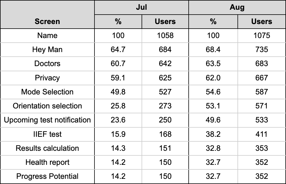
Last summer, we discovered that our registration completion rate was very low - just 14.2%. That was a wake-up call.
We immediately started working on it. By changing the tone of communication, we more than doubled the conversion up to 32.7%. See the table below.
At the time, this felt like a big win for us. Not just for the product, but also from a medical perspective. We even turned this into a research case and submitted it to the World Meeting on Sexual Medicine (WMSM). It was accepted and presented this February in Porto, Portugal.
What’s next
But 32.7% is not our limit.
We kept digging into the data and quickly found three weak points: the name input screen, privacy screen, and “upcoming test” screen.
Name input screen
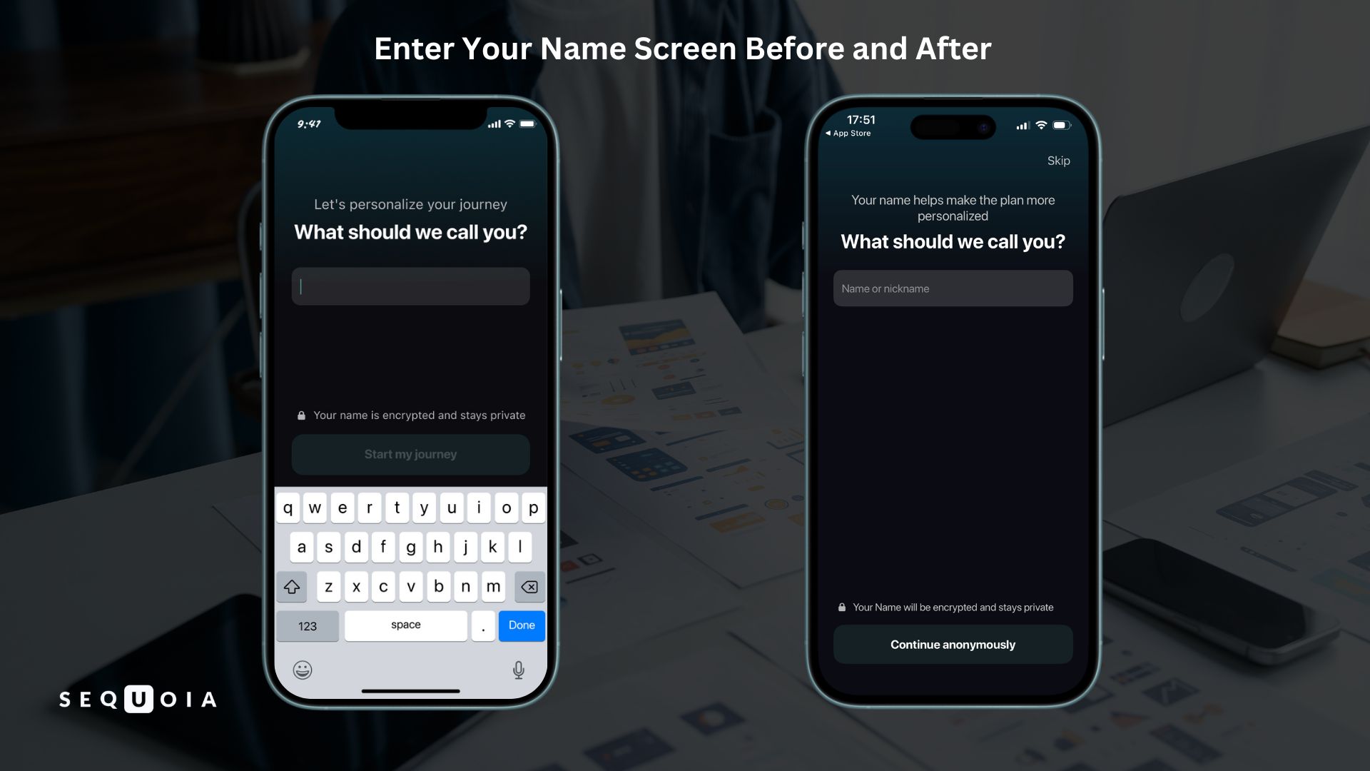
We were losing 31.6% of users on the name screen - the very first screen.
Why?
From a psychological point of view, when a man is dealing with a sexual health issue, asking for personal data right away creates anxiety and distrust. Many users simply closed the app.
So we changed the flow.
Now the app first:
- greets the user
- explains how it can help
- shows it’s built with doctors
- highlights privacy
And only then asks for a name.
We also redesigned the screen:
- made the name optional (Skip button)
- allowed nicknames
- allowed numbers and symbols
- removed auto-open keyboard
This reduced pressure and increased trust.
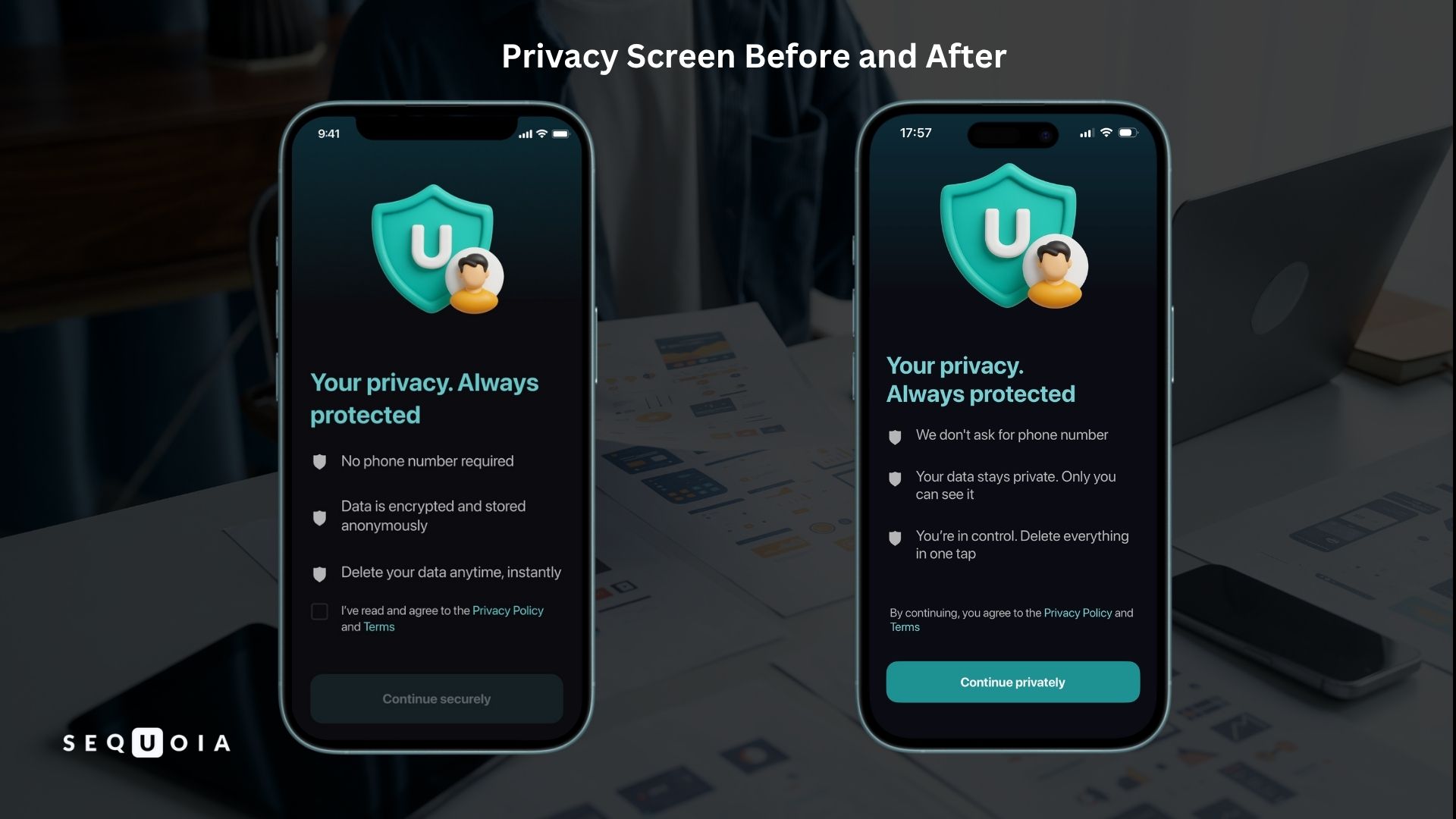
Privacy screen
We were losing up to 7.4% of users here.
Before, users had to:
- check a box
- tap "Continue securely"
We simplified it:
- removed the checkbox
- changed text to “By continuing, you agree to the Privacy Policy and Terms”
- made the button active by default
Now it’s one action instead of two.
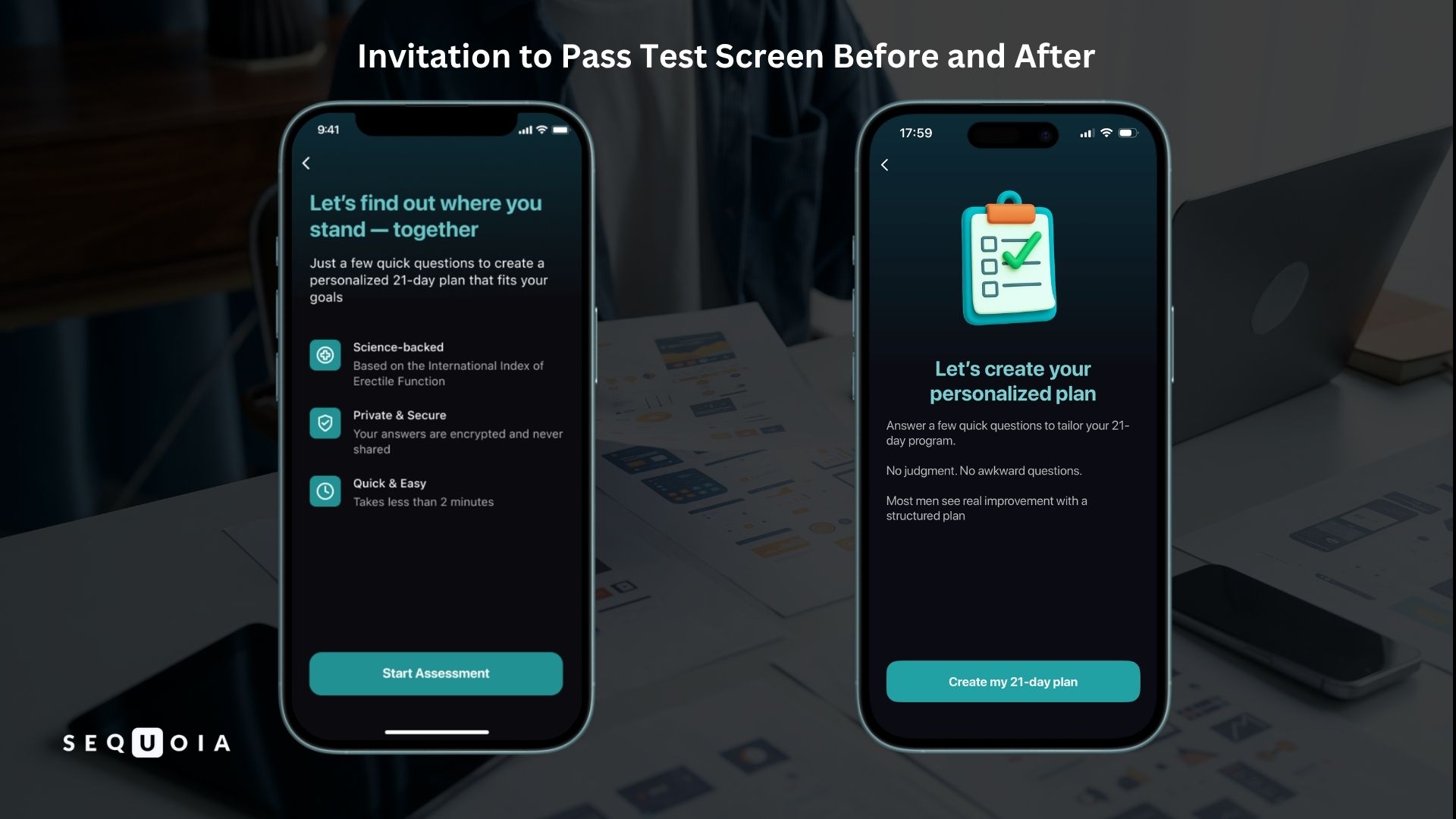
Upcoming test screen
On the screen where we tell users they’ll answer a few questions, we were losing 11.4%.
At first glance, it looked fine. We redesigned it:
- added an illustration
- reduced text
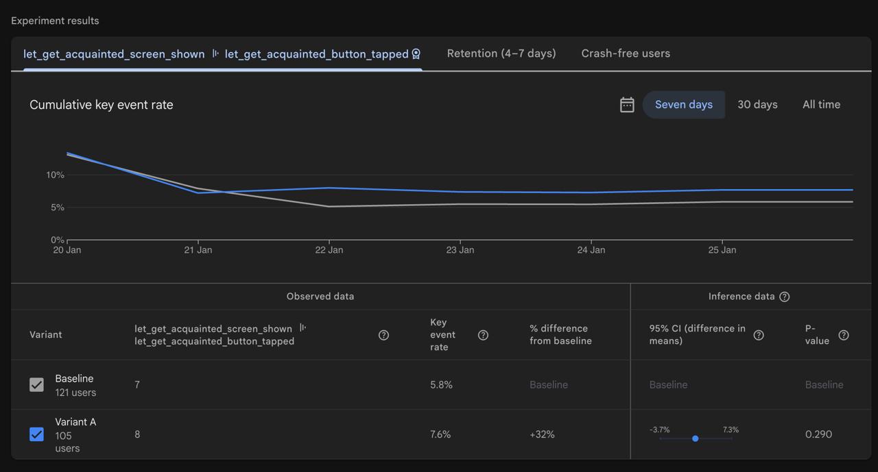
At first, it felt like just a visual update. But we wanted to understand what really mattered - so we used A/B tests.
A/B testing
Firebase provides a Remote Config feature that's quite useful. So we can:
- run multiple screen versions
- split audience (e.g. 50/50)
- see results in real time
- stop anytime
After testing, we can keep the better-performing version and hide the lower-performing one.
We ran all changes through A/B tests - even when results seemed obvious. In our opinion, the best practice is to rely on data, not intuition.
Expanding analytics
At the same time, we expanded analytics.
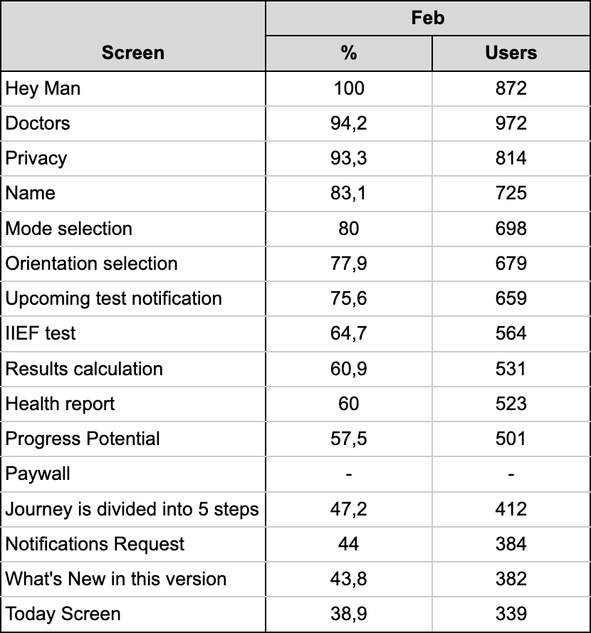
We started tracking all the way up to the home screen, including:
- paywall
- “your journey in 5 steps” screen
- notification permission
- “what’s new” screen
And we found something important:
If we consider the home screen as the final point (instead of Progress Potential, as before), conversion drops to 21%.
That’s expected - we added 4 more steps. But it’s a more honest metric.
Results
All changes were included in release 1.5.8 (January). But early data was noisy (due to A/B tests), so we analyzed February results.
Here’s what we got:
- Name screen drop-off decreased 10x (from 31.6% to 3.1%)
→ Hypothesis confirmed: don’t ask personal data upfront, build trust first. - Privacy screen drop-off increased (+2.4%)
→ Unexpected result. A/B test initially showed improvement, but the final data says otherwise.
→ Still investigating. - Test screen improved slightly (−0.5%)
→ Not significant yet, will review March data.
Overall results
- Conversion to Progress Potential increased from 32.7% to 57.5% (+24.8%)
- 38.9% of users now reach the home screen
Conclusion
This case clearly shows how important it is to know your numbers. Analytics helps you: see real problems, find bottlenecks, and make data-driven decisions.
My advice to founders: Track everything. Every screen matters. The earlier you start, the better for your business.
As for us, we’re not stopping here. More iterations coming soon. Stay tuned!
Warm regards,
Dzianis Halka
CEO of Sequoia
Related articles


Downlaod SEQUOIA
Start improving your sexual health

