The Impact of Communication Tone on Men's Engagement in Sexual Health Issues
Introduction
Men facing sexual health issues often experience shame, fear, and anxiety. Statistics confirm that more than half of men with erectile dysfunction symptoms do not seek help due to embarrassment. This means that the tone of the conversation, whether with a live doctor or a mobile app, is no longer a formality but a key factor in engagement.
Sequoia, a digital platform for men's sexual health, faced this problem head-on. In the summer of 2025, analytics revealed an alarming picture: out of 1,058 new users, only 150 (≈14.2%) completed registration. This means that only one in seven interested men received recommendations. Moreover, all onboarding screens were designed with meticulous medical precision—strict terms and neutral wording. This, as it turns out, was precisely what was driving users away. The hypothesis was this: men leave not because of the content, but because of the tone. Formal phrases when discussing sensitive topics create the feeling of a faceless "medical office" instead of a supportive dialogue. Research confirms that even minimal elements of warmth in a digital interface reduce anxiety and increase user retention. We decided to test this in practice.
Methodology and Changes
In early August 2025, we released version 1.5.4 of the app with an updated onboarding experience. All changes were limited to the text and visual design—the medical content remained the same. Six key areas of improvement are described below.
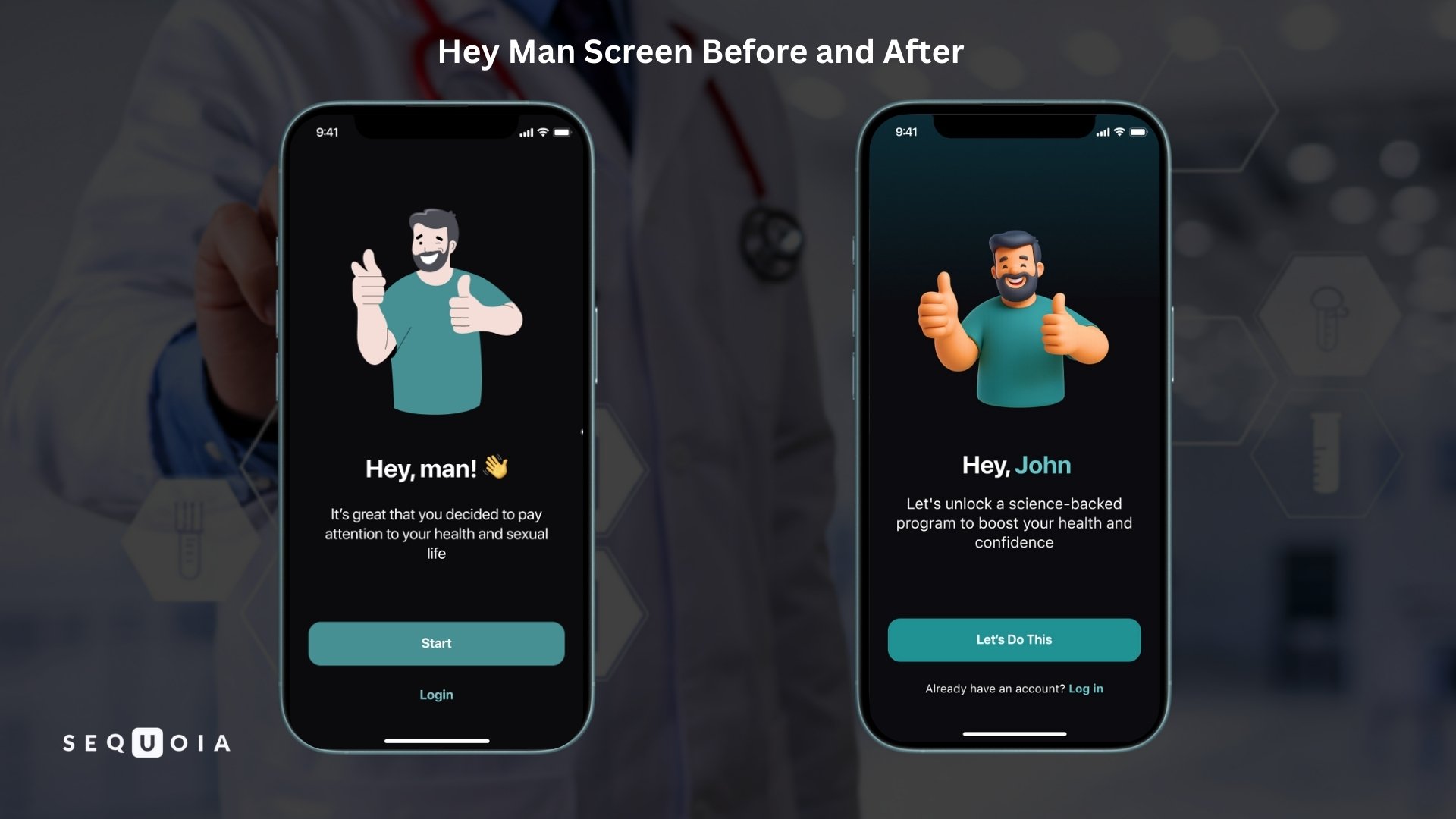
- Personalization. The app now addresses users by name from the very first step. The greeting title changed from the impersonal "Hey man!" to the personal "Hey, [Name]!" Motivating phrases like "You're on the verge of..." appeared throughout the text, replacing the dry "It's good that you decided..." Action buttons were also updated:
- "Start" → "Let's do this!"
- "Continue" → "Start my journey"
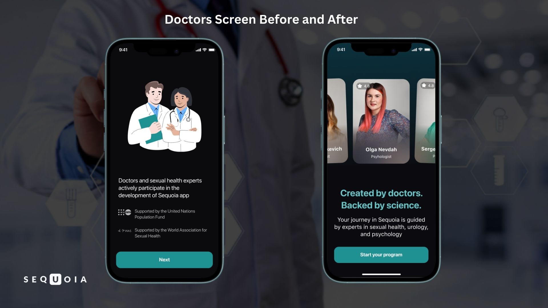
- Trust in Expertise. Generic illustrations of doctors were replaced with photographs of real medical experts, including their names and specialties, while the screen headline was changed to “Created by doctors. Backed by science.” This allows the user to immediately see the real professionals behind the product.
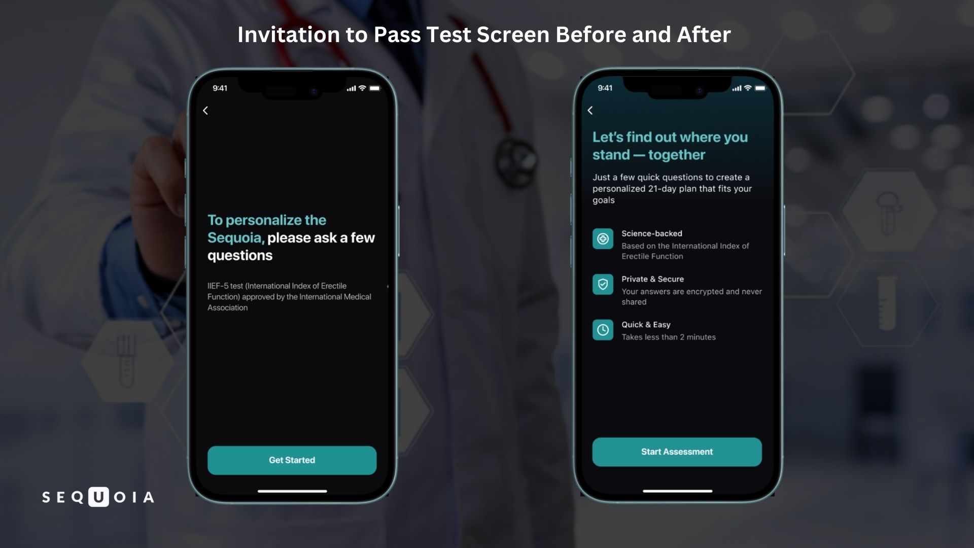
The screen shown before the IIEF test was also redesigned. Instead of a dry prompt to answer a set of questions, it now features the headline “Let's find out where you stand — together” and three short points:
-
- “Science-backed”
- “Private & Secure”
- “Quick & Easy”
As a result, what once felt like a formal requirement is now presented as an invitation — the user understands that the test is there to help him, not simply to complete a procedure.
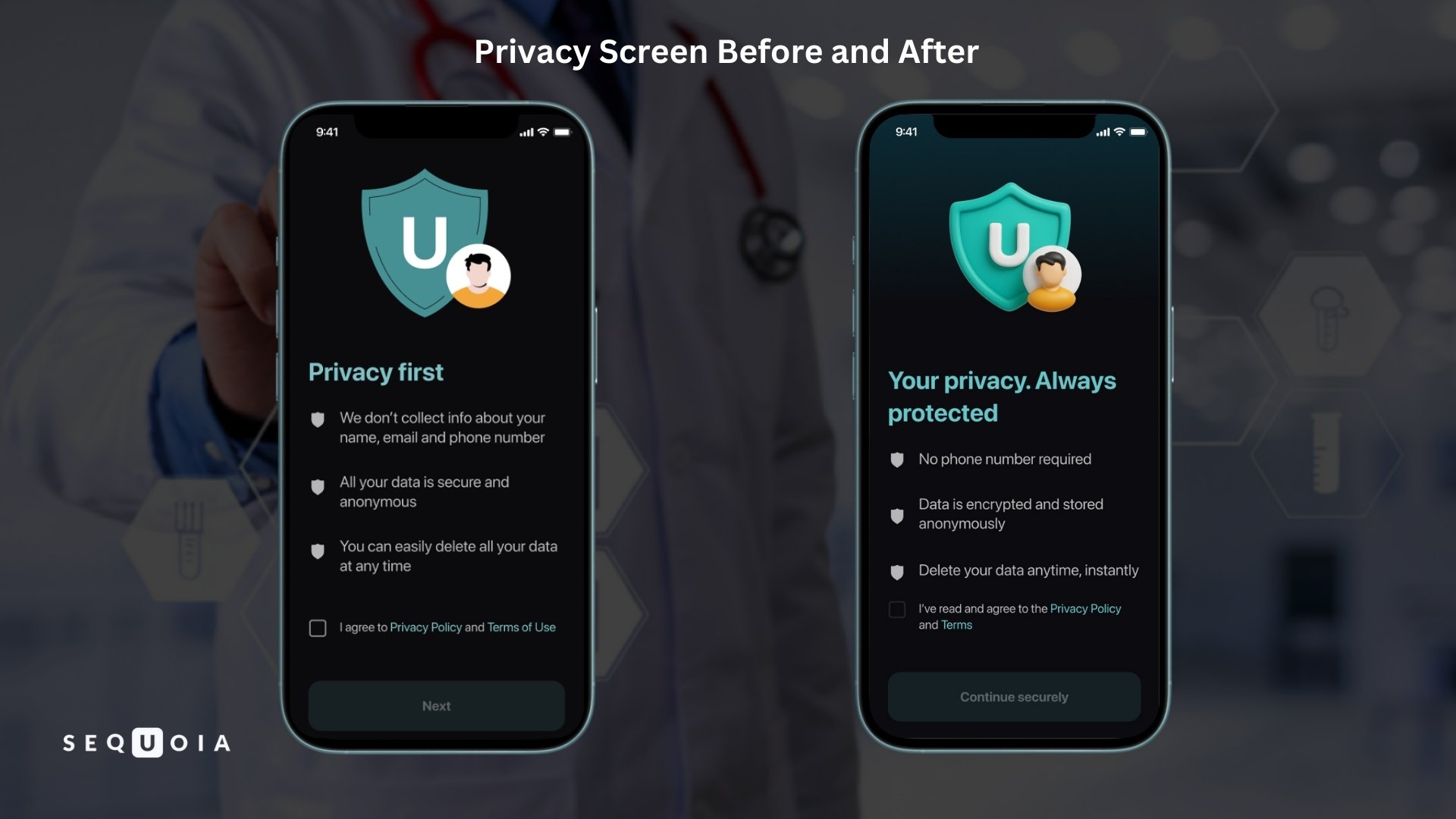
- Privacy and Control. The consent screen was updated: instead of listing plain facts — a clear headline and concise bullet points.
| Before | After |
| «We don't ask and collect your phone number» | «No phone number required» |
| «All your data is secure and anonymous» | «Data is encrypted and stored anonymously» |
| «You can easily delete all your data at any time» | «Delete your data anytime, instantly» |
The headline changed to «Your privacy. Always protected», and the confirmation button shifted from «Next» to «Continue securely».
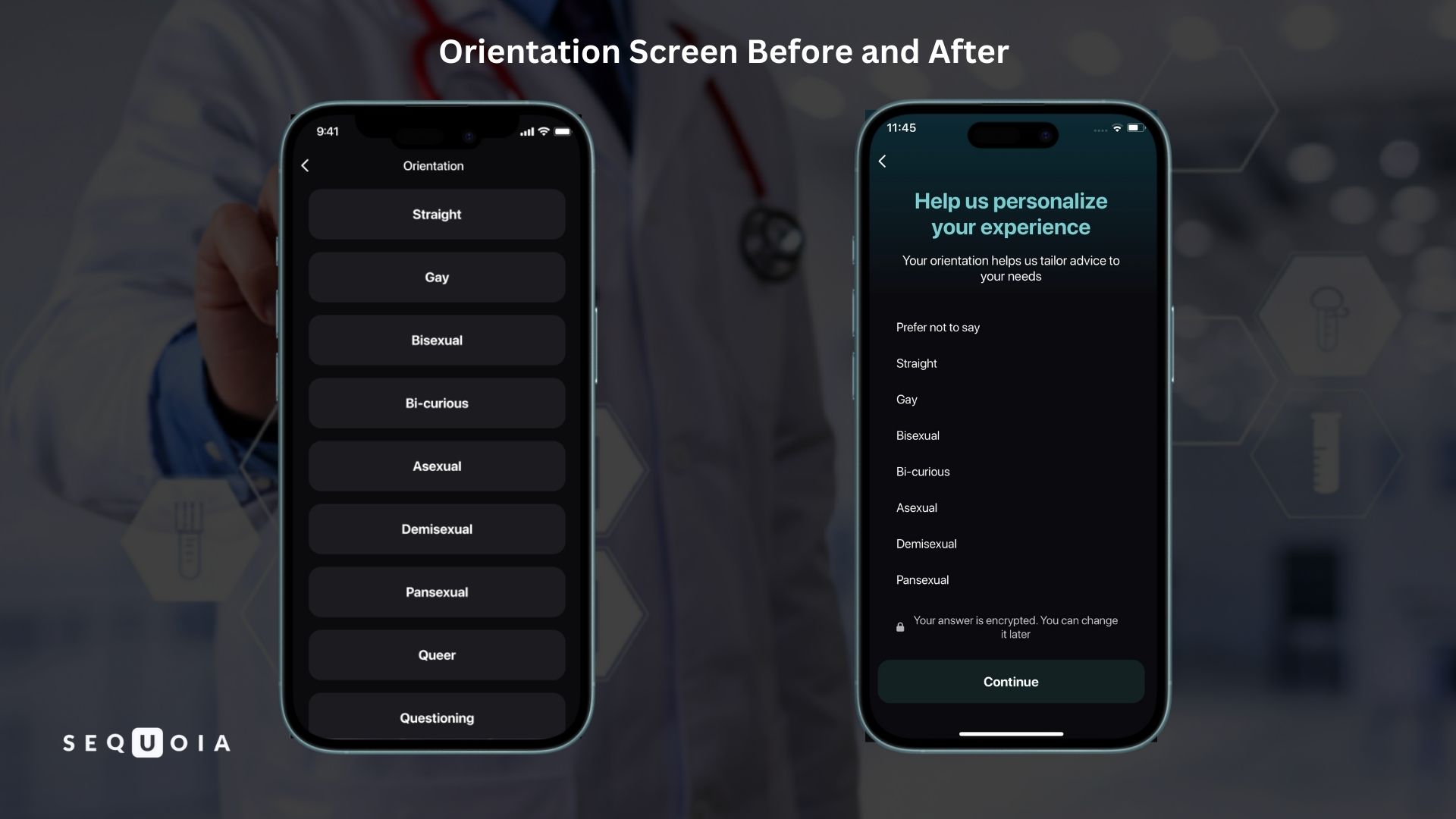
Three key elements were added to the orientation selection screen:
-
- An explanation of purpose: «Your orientation helps us tailor advice to your needs. You can change this later»
- A «Prefer not to say» option
- Fine print below the buttons: «Your answer is private and encrypted. You're always in control»
- Calls to Action. Previously, most buttons were short and purely functional. After the tone update, they were rewritten to carry both meaning and emotional momentum:
| Before | After |
| «Continue» | «Start my journey» |
| «OK» | «Start My 21-Day Plan» |
| «Got it» | «Let's Continue» |
As a result, each tap now feels like a deliberate step forward rather than just a transition to the next screen.
Taken together, these changes shifted the tone of communication from neutral and formal to supportive and encouraging — without compromising medical accuracy.
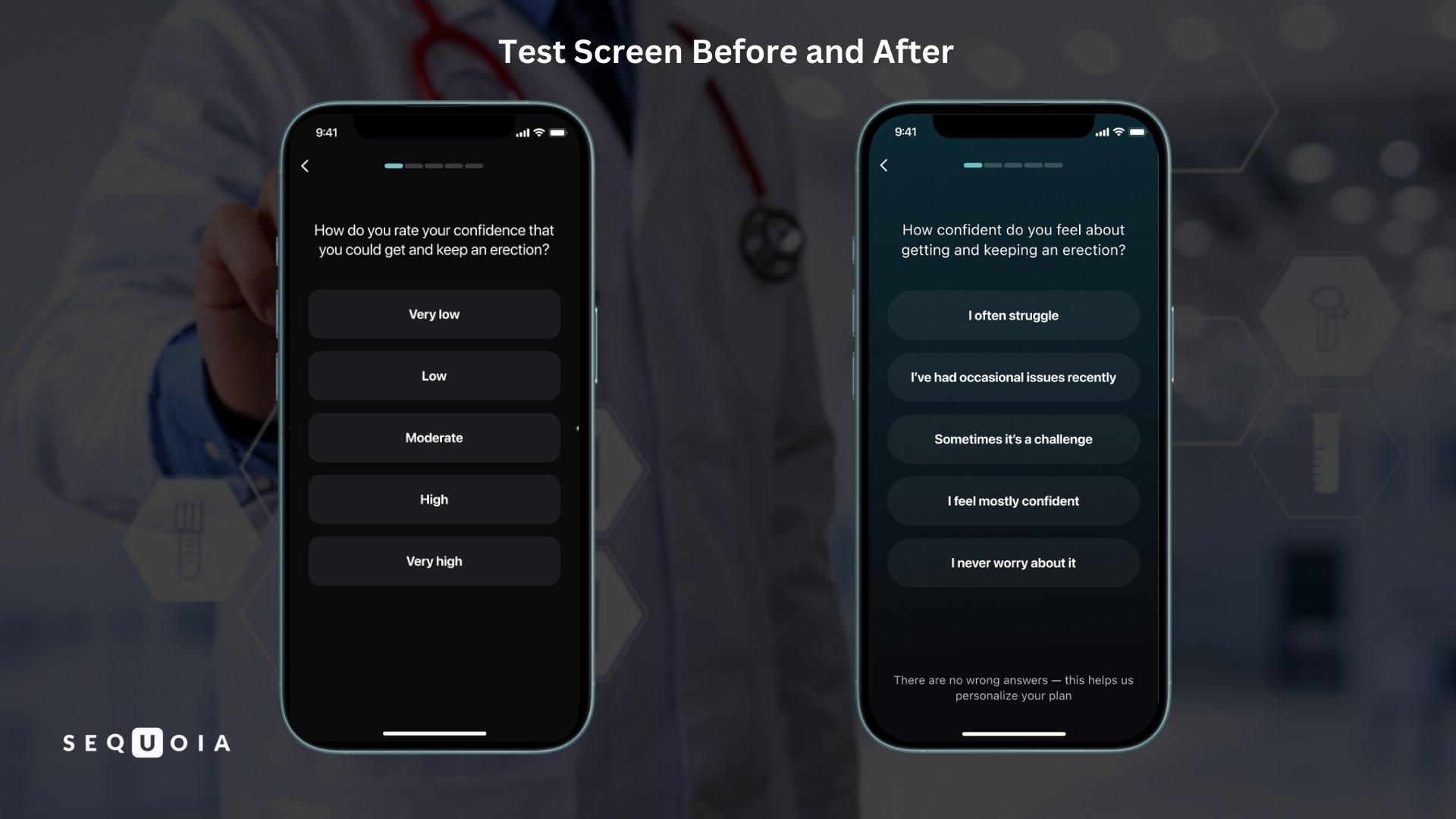
- Plain language instead of medical language. All questions and instructions have been rewritten in a conversational style. For example, the IIEF question:
- Previously: "How do you rate your confidence that you could get and keep an erection?"
- Now: "How confident do you feel about getting and keeping an erection?"
Formal answer scales ("Almost never or never," "A few times," etc.) have been replaced with clear phrases: "Yes, this happens often / Yes, especially recently / Yes, sometimes / Yes, but that was a long time ago / No, never." A footnote has been added under each question: "There are no wrong answers. This helps us personalize your plan." The test is no longer perceived as a "doctor's exam" and becomes part of a personal planning process.
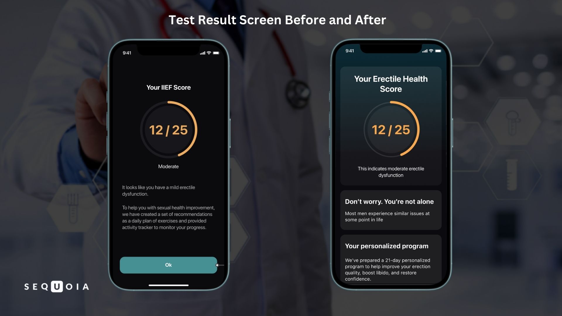
- Empathy and support. Phrases that reduce feelings of loneliness in dealing with a problem have been added to key steps. After the IIEF test result is displayed, the subtitle "Don't worry. You're not alone" is displayed, explaining that most men face similar challenges at different points in their lives. On the final screen, the user is greeted with the words "Keep going – you're on the right path," reminding them that small steps lead to big changes. All of this builds confidence and motivation to continue.
Results
The September 2025 data confirmed our hypothesis: final conversion increased from 14.2% to 32.7%, which means it more than doubled. In practical terms, one in three users now completes the registration flow, whereas previously only one in seven reached the end.
Registration funnel: July vs. September 2025
|
Screen |
July |
September |
||
|
% |
Users |
% |
Users |
|
|
Name input |
100 |
1058 |
100 |
1075 |
|
Hey Man |
64.7 |
684 |
68.4 |
735 |
|
Doctors |
60.7 |
642 |
63.5 |
683 |
|
Privacy |
59.1 |
625 |
62.0 |
667 |
|
Mode selection |
49.8 |
527 |
54.6 |
587 |
|
Orientation selection |
25.8 |
273 |
53.1 |
571 |
|
Upcoming test notification |
23.6 |
250 |
49.6 |
533 |
|
Question-based test |
15.9 |
168 |
38.2 |
411 |
|
IIEF calculation |
14.3 |
151 |
32.8 |
353 |
|
IIEF report |
14.2 |
150 |
32.7 |
352 |
|
Future progress notification |
14.2 |
150 |
32.7 |
352 |
As the table shows, the overall registration completion rate rose from 14.2% to 32.7% - more than a twofold increase. In other words, one in three users successfully reached the end of the initial program flow, compared with only one in seven before the update. The most striking improvements occurred at the stages that had previously shown the highest drop-off.
Orientation selection. In July, only 26% of users continued past this step, meaning about 74% dropped out at the orientation screen itself. After adding a softer introduction, the “Prefer not to say” option, and explicit privacy reassurance, conversion at this stage rose to 53%. User retention at this point effectively doubled, which strongly suggests that a more empathetic presentation reduced fear and uncertainty around this sensitive question.
Upcoming test information screen. Previously, the dry wording “Erectile Index (IIEF) test, approved by International Medical Association” created confusion or tension, and only 23.6% of users moved forward from that step. After the text was revised to explain the purpose of the test in plain language and emphasize privacy, nearly 50% of users proceeded. By removing bureaucratic phrasing and adding motivation, we were able to re-engage a large share of users who had previously been put off by the term “IIEF test” itself.
Test completion (question series). Thanks to friendlier wording and the note “There are no wrong answers”, substantially more men completed the questionnaire. In July, only 168 users finished this stage, or 15.9% of all users who entered the funnel, whereas in September that number increased to 411 users, or 38.2%. This is an improvement of more than 2.4 times. This result is particularly important because once a user has answered all questions honestly, he has already invested emotionally in the process and is much more likely to follow the recommended program.
A smaller but still positive shift can also be seen at the very beginning of the funnel. After the welcome screen, 68.4% of users now remain, compared with 64.7% before, and at the doctors screen the figure increased from 60.7% to 63.5%. Although the difference is not as dramatic as in the middle of the funnel, the pattern is clear: a warmer tone helps hold attention even at the earliest stages, when users are only beginning to acknowledge the health issue they are facing.
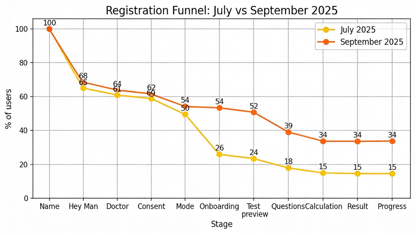
Pic 1. Registration funnel in the Sequoia app before the communication tone update (orange line, July 2025) and after the update (red line, September 2025).
The chart shows that the gap between the orange and red lines is largest in the middle of the journey (onboarding, questionnaire) – exactly where psychological barriers played the biggest role. At the beginning and end of the journey, the difference narrows, but the overall effect is substantial: the red line stays significantly higher, leading to more than a twofold increase in final conversion.
Discussion
The results clearly demonstrate that tone of voice is a critical factor for user engagement, especially in such a sensitive area as men’s sexual health. Once dry, formal wording was replaced with friendly and supportive language, hundreds of men who had previously dropped out halfway through registration started completing it. Below we break down why this happened.
- Lower psychological barriers. Addressing users by name, expressing empathy, and normalising the problem (“most men go through this”) turn the app from a cold tool into an ally. The user stops feeling like “a patient at an appointment” and starts feeling supported.
- Transparency and sense of control. When users are told why a particular question is being asked and are given the option to skip it, their anxiety decreases. The mindset shifts from “they demand my data” to “I decide what to share”.
- Focus on solutions, not diagnosis. The new copy redirects attention from the problem to a concrete way forward: a personalised 21 day plan and tangible improvements. This boosts self efficacy – the belief that the situation can be changed.
- Trust through human presence. Photos of real doctors with their names create the sense that there are real professionals behind the app, not an impersonal corporation. This is especially important when a man is trusting a digital service with an intimate part of his life.
- Balance of warmth and action. The gentle tone is combined with energetic calls to action (“Start My 21 Day Plan”) and clear benefits. The user is not “soothed into inaction” but motivated to move forward.
Conclusions
When a man faces sexual health problems, he is in an especially vulnerable position, often experiencing fear, shame, and doubt at the same time. At this moment, the tone of communication from a doctor or mobile app becomes crucial. Our study clearly showed that a friendly, supportive interaction style can significantly increase a man’s trust and his willingness to act. Impersonal, strictly medical language, by contrast, strengthens barriers and alienates exactly those who need help the most.
After changing the communication style in the app, the registration completion conversion rate increased from 14% to 33% – more than twice as many men reached the recommendation stage and started working on improving their condition. Particularly important is that we managed to overcome the “bottlenecks” – the steps where most users had previously abandoned registration: the question about sexual orientation and the assessment of erectile function. By adding clear explanations, a touch of empathy, and a guarantee of anonymity, we restored motivation for hundreds of men who otherwise would not have received the help they needed.
This experience aligns with a broader pattern: in intimate health, accurate information alone is not enough – people also need to feel safe and accepted. Surveys show that more than 50% of men with erectile dysfunction do not seek medical help because of embarrassment and anxiety. This means that the professional’s first task is to establish a trusting connection and speak the same language as the patient. When a man feels comfortable and not judged, he is far more likely to engage in diagnosis and treatment.
The right tone of communication directly affects adherence to recommended actions. For practising clinicians, this is a strong argument for deliberately developing empathic communication skills. For digital health product teams, it is a reminder that UX copy and microcopy are full fledged tools of therapeutic interaction, not just interface details. Going forward, we plan to extend these approaches to other sections of the app and share our findings with the medical community so that as many men as possible can receive the help they need in the most effective and sensitive way.
References
1. Sequoia app data. Internal onboarding conversion analytics before and after the update (July and September 2025).
2. Sundar, S. S., & Bellur, S. Human Communication Research (2017). “Conversational tone in online health Q&A improves user engagement and comfort.” https://www.mobihealthnews.com/news/study-looks-how-interactivity-tone-affect-engagement-digital-health-tools
3. The Urology Foundation (2022). Press Release: “Men are still not taking erectile dysfunction seriously.” https://www.theurologyfoundation.org/about-us/media/press-releases/dolor-amet/